Improve "Climate Report" graph
The horizontal grid lines in the "Climate Control" history graph currently behave very inconsistently and are not very clear to work out the temperature from.
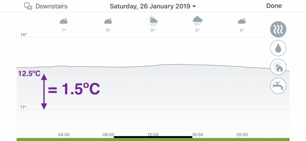
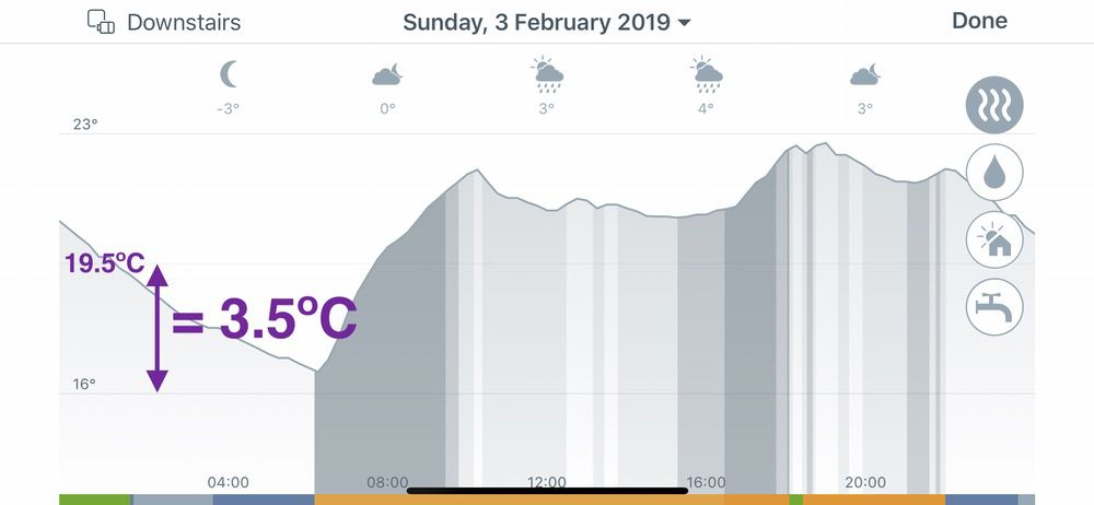
There are three fixed lines, the top and bottom have a label which varies depending on the range of the currently displayed graph, but by having fixed lines, this means the degrees difference between them varies:
Sometimes it's 1.5ºC:
Sometimes it's 2.5ºC:
Sometimes it's 3ºC:
Sometimes it's 3.5ºC:
This, coupled with the fact that the middle grid line has no label, means you end up having to do the following calculation everytime you wish to work out the temperature that the middle line is indicating: (Top Line Temp - Bottom Line Temp) / 2) + Bottom Line Temp.
This makes it harder to work out from glancing at the graph what temperature a particular point is (without having to tap and hold).
So, instead of this:
Can we please just have a single grid line for each 1ºC:
As you can see, it's now much easier to discover at a glance that the temperature rose up to 22ºC in the morning, was 21ºC during the day and then increased to 22ºC in the evening.
This isn't easily possible with the current, unclear gridlines, so you end up have to tap, hold and drag to work it out, rather than just seeing it at a glance.
Comments
-
..................+1
excellent idea
1 -
The heating history is a nice feature but it would be even better if you could select which rooms to view so you can review heating for multiple or even all rooms.
0 -
Hi @mw9342
The heating history is shown by room - so if you are looking at your living room, then the graph relates only to that room.
If I misunderstood your suggestion, could you perhaps rephrase it for me?
Best regards,
Frank
0 -
What I was trying to say is that I would like to see the heating history not just as one graph per one room but one graph for many rooms. So you open then graph window and then select which rooms to see and you then see the history for those selected rooms in the same graph. Hope that makes it clearer.
0 -
Yes please, this is very annoying in its current form.
0 -
Hi ted° team
while I like the climate report for every thermostat, browsing that day by day is quite unsueful
It would be great to have a better overview:
e.g.: average temp in a specific room, average "usage" of the heater etc etc in a given period
even better, it would be to get the ability to export raw data in Excel!
Thanks
2 -
Or simply allow data export to CSV or Excel so everyone could process stats as he/she likes.
2 -
Agree multiple rooms overlays and possibility to download would be appreciated1
-
+1 for multiple room overlays0
-
me too, I'd like to export my data into Excel or csv
1 -
It would be great if I could view it on the website rather than just the phone app. A larger screen would allow me to view more information for a longer period of time. Being able to export the data would be even better!
1 -
Yes, I must say that the graphical interface on the app is very difficult to interpret. It would be so much simpler if you could predefine the range - for example, 15-25° - and plot the data using the same range without changing every day and having different scales for different devices. And of course, none of these problems would be serious if you could just download all the data as a file that can be imported into Excel. That way, I wouldn't care about the graphs being weird on the app.
2 -
There are several good suggestions in this thread, but they’ve diluted @jcwacky‘s original simple, very cogently argued request. I too am mildly exasperated (each time I look) by the inconsistency of the grid lines between days and between rooms, which make visual at-a-glance comprehension of the data harder than it need be.
I wonder how many other people think likewise, but grumblingly just put up with it. It seems such a minor tweak to a function that is already there, for so much benefit.
1 -
Came here to post this exact issue with the horizontal lines! Can't believe this is an issue since 2019. Also seeing 18 and 23 with a single horizontal line for 20.5. It's be MUCH more intuitive to have a horizontal line for each 1 deg.1
-
Another improvement would be an additional series showing the target temperature over time.0
-
+1
Amazed that this got past UAT !
Also would strongly vote to see all rooms at the same time - so I can see the consolidated view of when my boiler is getting calls for heat throughout the day.
1 -
Yes. THIS. I came to the forum with this exact request as it's bugging the hell out of me. The graph is one of my favourite Tado functions but the random temperature lines drive me crazy. PLEASE fix this! Also, would it be possible to relocate the display option buttons to the top of the graph (not blocking any data) as I often can't see the data in the late evening when my heating is most important?1
-
I agree. Please fix it and allow the Export in Excel or .csv
PLEEEEEEASE!
0


