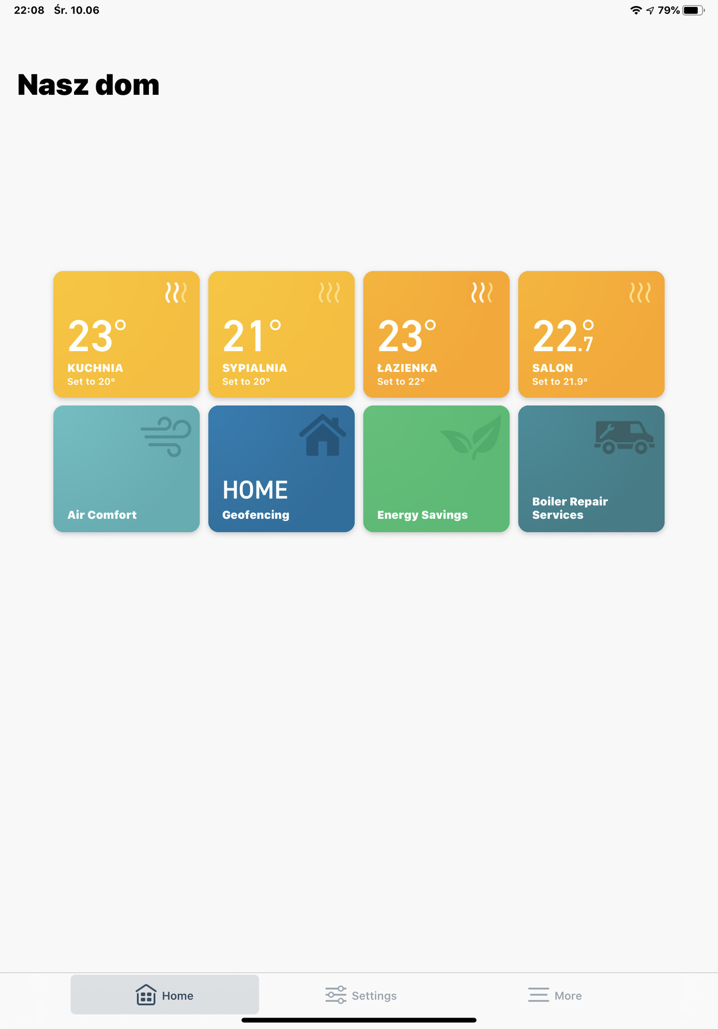
[Released – ver. 5.10] Add back the "heating level" indicator in V3+ app
Comments
-
Nice to hear that @jcwacky. I haven't done anything in photoshop for years, I will do one more concept graphic for TADO graphics ;-)
Hear the heat indicator symbol are the same size like the original. I think this look good and keeps its proportions, how about this version?
5 -
However, if you are consistent with the layout we have after entering the room:
it should have this layout:
make only one example. How about this?
1 -
While all this is going on, tado should consider changing WHITE FONT ON YELLOW BACKGROUND. It is possibly the worst combination for people with poor eyesight
2 -
Whether the heating indicator is below or in the top right cogent of the tile doesn't really matter; what matters is that it's there in the first place. tado already uses the top right corner of the tile in the main view to show off and open window indicators; therefore, it makes perfect sense to place the heating indicator in the same place; and the argument of tado not to put it there to avoid a "crowded" interface makes no sense; if it was then why putting the other indicators in the top right corner?
So please do the right thing and show the heating indicator in the main view.
5 -
Yeap, hope that make this change soon, is nothing complicated and basically it should be from the very beginning there. It will be also nice that you will able to manual quick set the temperature also from the main screen, isn't it?0
-
@Freeman , That's exactly what would beneficial, to have all useful info in one, as a cockpit board.
Best regards.0 -
I think that
- that indicator would be very useful (I'd love to also have humidity)
- It should be a users choice to decide what's important/relevant for them so it would be nice to have it configurable from a list example: tiles content: temp+heat level+target or temp+humidity only... and so on...
all the information are already available and not showing them is just "a decision" from tado about what they consider the best option.
I'm not a fan of too many information I agree and understand ... but I am a big fan of configurability.... so please.... let us decide what is important for house house heating system dashboards...
0 -
This would be a good modification, can we see it happen please?1
-
Maybe a new thread should be created to give visibility to this request? (although it is related to it)
This thread being marked as completed, the request might not get enough visibility from both users and tado°.
I agree with all of you that, although a clean screen may be more appealing to new users and potential customers, configurability should enable power users to get the information they need in an efficient fashion.
1 -
I agree with this, having just added 4 Smart TRVs! Why does it say this is completed, and where do I find the Announcement?0
-
I would like to also see whenever the Boiler is ON (Relay). The wavy lines are useful to an extent but there is not way to tell when the boiler is fired up.
0 -
Hi, what is the input to the boiler if the there is only 1S (33%)Does it call for heat and just modulate the TRV valve at the radiator on and off. ??0
-
Is it just me? Or has this been removed again??0
-
Ah, no I thought it had been added back to the tiles, but appears not.
0 -
I think that the discussion you are searching for is https://community.tado.com/en-gb/discussion/9218/add-the-heating-level-indicator-1-2-3-bars-to-the-home-screen-in-each-room#latest
1


